Thursday, 8 December 2016

Magazine front cover

Magazine front cover


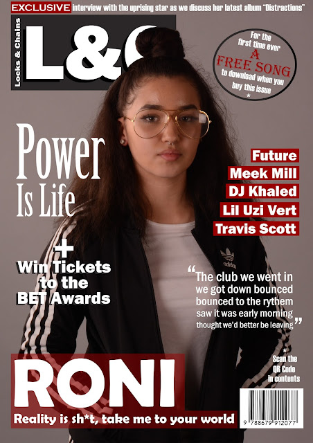
This is my completed front cover. I took on the advice of some other people and they suggested for me to put a shadow on 'Power Is Life' and in my opinion it makes it clearer and easier to read. They also said i can stock to the idea of adding a shadow to the puff to make it stand out more because i am trying to promote something on it, which i thought made a lot of sense. I added a date to the top and the issue number right under it. Lastly they advised me to add a little slogan under the Masthead because most magazines have this. 

Magazine Contents

Magazine contents


This complete version of my front cover clearly shoes the type of contents in my magazine. I included the QR code at the bottom because in the front cover it said to scan the code in my contents page. As you can see, in the background there is a logo 'L&C' which is behind everything. I included this because i think it is unique and it fits in perfectly since it isn't blocking anything.

Magazine DPS

Magazine DPS


The changes i made are the good suggestions from other people. one of the changes i made is the shadow surrounding the white box. this makes it standout from the background and overall it brings it forward which shows that it is important. Another change i made was to the background. I was told a lot that the background colours would make it very difficult for text to go over it because of the wide variety of colours so making it black and white allows the Anchor at the top to stand out even more. Last change was the social media logos at the bottom. this indicates to readers that we have other ways to contact L&C headquarters for feedback on the magazines that we make or if they wish to tell us anything.

Monday, 28 November 2016

Real Magazine - Front cover (work in progress)

Real Magazine - Front Cover (work in progress)


This is my front cover so far. it is not complete. i wanted to get feedback from other people that fit the target market because if they were to go to a shop for a music magazine the front cover is the thing that determines if they are interested in buying it or not, since it is the first they see. once i obtain the feedback needed i will take it all on board and adjust this cover until it is perfect.

Tuesday, 22 November 2016

Real Magazine - DPS - v2 (Work in Progress)


Real Magazine - DPS - v2


This is the second version of the double page spread that i made. I chose this image because my cover star is not taking up the whole two pages so this allows me to leave some space for the text to go on. the change i made was to the bars at the top and the bottom. i made them grey instead of white because i think that grey is a more subtle colour and it doesn't really stand out. 

Real Magazine - DPS (Work in Progress)

Real Magazine - DPS - v1

This is the first draft I made for the double page spread. in my opinion it didn't turn out as good as i thought it would but the layout of the bars at the top and the bottom, i kept. it makes the double page spread look more professional and i think it works well.

Friday, 18 November 2016

Questions for DPS

Questions for DPS

So you have a new album on the way right; “Duration”? Tell me what inspired you to make it.
  • It was all the free time I had and the personal experience that I went through that helped me come up with such a great album. Seriously, I can’t believe it is still number 1 on the charts today and I just have to thank the my fans, my family and my boys for helping me achieve this goal.


Life on tour is said to be difficult. How are you finding it?
  •      Not gona lie, I’m finding it not only fun but it is also tiring because of all the travelling. There is no time to rest pretty much because when we are on the road all my girls just scream at the TV because they are not as good as I am on Call of Duty (laugh).
  •         Oh really, clearly you haven’t played me yet (laugh)
  • Hahaha, well see about that. Okay another thing tho, honestly, it’s not as glamorous as the media portray it to be. Imagine finishing a long concert and then immediately being on the road only to head straight to another concert. Don’t get me wrong, I like performing but it is so time consuming but I think the whole overall experience is worth the struggle.

Your song “Slide in” has been number 1 on the hip hop charts for 3 weeks now. How do you feel about this?
  • ·        Didn’t expect
  • ·        Something relatable
  • ·        We all get our 15 mins of fame

Do you feel you have reached your goal as an artist or do you aspire to reach the souls of your “haters” with your music?
  • ·        Haters are haters
  • ·        Never reach
  • ·        Once you reach a goal, keep going
  • ·      Another goal
  • ·        No limits

What are your favourite ways to pass time and why?
  • ·        Drawing
  • ·        Exercising
  • ·        Good outlets for stress
  • ·        Evidence for people to see what you do with your time


Let’s put the music aside for now, there has been a lot of controversy about your views on Donald Trump winning the election. Tell me, why do you believe he is capable to be a good president?
  • ·        He is a genuine person
  • ·        Honest
  • ·        Stick to his points

Thursday, 29 September 2016

Mock up - Contents Page Plan

Mock up - Contents page


This is a rough idea of what i want my front cover to look like. When i make my magazine i plan to keep the font the same and the layout as well, however the background will change because i do not have access to that colour.

Mock up - Double Page Spread

Mock up - DPS

When it come to me making the double page spread i plan to have the Model or models spread over the two pages because it looks more neater and more professional in my opinion. I like the way i made the anchor go behind the model, it connotes dominance and it needed to further relate to the genre of music i am doing for my magazine.

Mock up - front cover

Mock up - Front cover


Today I had made two plans for what I want to make my front cover look like. I am still deciding which one to go with and which one fits my genre the best. My genre is Hip Hop; keeping this in mind I need to choose one which is more attractive to my target audience. I asked people around and on social media and most so far are saying the Drake cover but I will give it more time before i come to a final decision. I was thinking of changing the font of the "Chains" magazine because i don't think it matches with the other fonts used in the magazine as well as i thought.

Tuesday, 27 September 2016

Magazine pitch

My pitch idea

Feedback

I was told that my magazine draft was too subtle or soft for my genre so i took this into consideration when creating my two new front covers. My two new front covers can be seen below in the blog. i feel that this response was really helpful because i want to relate to the genre i chose as much as possible to attract more of my target audience.

Draft for real DPS


Draft for real front cover


Photoshop practise


Magazine proposal

Magazine proposal

·               My magazine will be called either “Chains”, “L&C” or “Locks&Chains”. The reason I chose these names are because rappers and hip hop artist often wear chains to show off their wealth.
·           The genre my magazine will be about is Hip Hop and Rap because this is such a common choice of music that the younger and older generation listen to.
·        The artists I plan to have on my magazine are:
-         DJ Khaled
-         Drake
-         Future
-         Ace hood
-         Nicki Minaj
·             In every issue I plan to have to keep the audience updated with the latest news that’s going on in the media so they don’t miss out and want to come back every time for more.
·            Also in every issue I want to add a QR code that can be scanned on Spotify or Soundcloud, for example, so that the audience can get a free song to listen to.
·             My magazine will be different from others because I plan to interact with the consumers by having a social media page and allowing the audience to tweet or send us questions that can be answered by celebrities in special interviews. This is called “#AskChains”
·              The colour scheme is going to be either burgundy, black and gold or white, light blue and diamond texture or platinum because these colours are often seen as a luxury so in order to stick with the theme of wealth I wanted to use these.
·              The masthead will be in a gold font to yet again stick to the theme of expense.


Monday, 26 September 2016

Evaluation for college magazine

Evaluation

  When creating the magazine contents page I wanted to make it have a simplistic looks so it is easier to read and not look all over the place. the LSC colour scheme I used were blue, yellow and white/black. This matches with the logo for LSC and because I was making a magazine to do with the college I wanted to keep it the same. I like how I had the heading "contents" in 2 different colours because the design is different to what you would really see on a contents page and also it is eye catching. I also like the fonts used because it doesn't make the content page look so boring and generic. on the other hand i think that the fact that the pictures i used were not all the same size may draw people away because it doesn't look professional, instead it looks a bit messy. i got feedback from the class and one thing i got told was that for my front cover i should make the font of the coverlines a bit brighter because it blends in with the background. i agree with this and i will implement it when making changes to the page. the things i think i need to improve on is creativity. i need to be able to make my front cover looks completely different to a typical one. i need to add my own designs that are appealing and also make it looks professional.


College Magazine Contents Page


Sunday, 25 September 2016

College magazine front cover


college magazine front cover - draft


Textual analysis - College magazine


Textual Analysis - College Magazine


Image
  • 3 Colour scheme
    - black, yellow, white
  • Coverstar is in front of the masthead because the magazine is well known
  • Mise en scene:
    - leather jacket
    - white t-shirt
    - holding books
        + shows the magazine is educational
    - chain
    - positive facial expression
  • Skyline
    - lets readers know what else is in the                   magazine 
Page layout
  • Cover line:
    - 2 columns
    - colour scheme
    - includes other information that is in the             magazine
    - same font, sans serif
        + emphasises simplicity
  • Puff
    - says lets go paintballing
    - attracts the target audience with a well known activity 

Thursday, 22 September 2016

My Own Textual Analysis - Contents Page


Textual Analysis - Contents Page

Image
  • Close up (CU)
    - connotes his importance
    - eye level angle
  • Mise en scene:
    - hoodie
    - multiple gold chains
    - gold bracelet
    - serious facial expression
    - pose with his hand
         + shows off his chains
         + emphasis his wealth
  • High key lighting
    - Star quality 
Page layout
  • One column 
  • List of other information in the magazine
  • Follows the same 3 colour scheme
    - black, white, yellow
  • Same font 
  • Contents information is in front of the cover star
  • Dark background to bring forward the cover star in the foreground 

My Own Textual Analysis - Cover page


Textual Analysis - The Source


Image
  • Medium shot (MS)
    - connotes elegance and sophistication 
  • 3 colour scheme
    - gold, red, black/white
  • Mise en scene
    - gold watch
    - gold ring
    - black and white suit
    - burgundy pattern in the background
    - an image of a rich man
    - fresh sharp trim
  • High key lighting
    - connotes star quality
    - V.I.P
    - mise en scene makes it look dark:
                + Shadows
                + Dark background
Page layout
  • The cover star is in front of the Masthead
  • Use of puffs:
    - tells indicates other celebrities which makes       them want to read on
  • Anchor is there in case readers don't know who the cover star is
    - The font is different to the rest
    - Serif
Genre
  • Coverstar indicates the genre this magazine is.
  • The puff shows other celebrities
  • Mise en scene:
    - Gold watch
    - Gold ring
    - Suite and bowtie

Textual analysis - double page spread


Textual Analysis - Double page spread

Image
  • (MS) Midshot
  • Mise en scene:
    - Cigar
    - Old  school
    - glamour
    - Expensive


Textual Analysis - Contents Page


Textual analysis - Contents Page


Image
  • MLS (medium long shot)
    - Body language
  • Mise en scene:
    - Clothing

Page layout
  • One column
  • "Features"
    - Sub headings
    - In depth
    - Longer articles
  • Page numbering in chronological order

Textual analysis - Title page


Textual analysis - Title page


Image
  • 3 colour scheme
    black, blue,yellow
  • Low angle shot:
    connotes dominance
  • MLS (medium long shot):
    Mise en scene:
    - As a pilot
    - Aeroplane in background
    - Pilot costume
    - Aviator shades - linked to pilot
    - White T-shirt
  • High key lighting connotes
    - Star quality
    - Iconic US star   
Page layout
  • Masthead behind the cover star
  • Skyline:
    - Other stars are the key selling points
  • Anchorage
    Main cover line - Reflects image
                              - Big
  • Cover lines:
    - Aligned
    - columns
    - colour scheme
    - sans serif font. Simple
    - Puffs
Genre evidence
  • Cover star, skyline: Artists reflect genre
  • Mise en scene:
    - Designer shades
    - Watch
    - White t-shirt

My Chosen Genre


My chosen genre


   I have chosen American Hip Hop as the genre I want to do for my magazine because I have grown up listening to it and I enjoy listening to it. One of my favourite artists currently is Ace Hood. I find that his music has some true meaning to them because he raps about how hard his life used to be when he was growing up but he turned to God for help and God came through for him. He's not like some other American artist that always rap about money and fame. One magazine that i will be looking at is "The Source"; it is know as the most powerful name in Hip Hop and Urban culture for 25 years. there are only 6 issues every year so appearing on the cover of it is a really big privilege to advertise yourself and make yourself known.

Production schedule


Introduction

My name is Humphrey and i am 16 years old. The reason I chose to study Media As is because I am very interested in the world around me and since media is everywhere I would like to gain the knowledge and the skills to do with this subject. I never studied Media in secondary school because it wasn't available so I am going into the subject not knowing anything about but it will be exciting to see what i would have learnt within the space of 2 years.