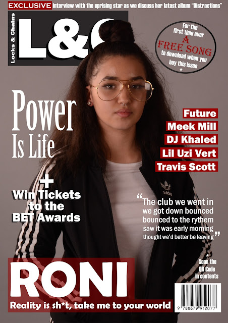
Real Magazine - Front Cover (work in progress)
This is my front cover so far. it is not complete. i wanted to get feedback from other people that fit the target market because if they were to go to a shop for a music magazine the front cover is the thing that determines if they are interested in buying it or not, since it is the first they see. once i obtain the feedback needed i will take it all on board and adjust this cover until it is perfect.

I really like the range of fonts you use for each cover line - makes them each stand out and looks creative and professional. Also the placing of the text on your front is evenly spread out, which makes the magazine easy to read and so your magazine doesn't look too messy with too much text.
ReplyDeleteVery neat, brilliant colour scheme! The text are all organised and aligned nicely which gives the magazine a fresh and professional look. Good image of the cover star; there is a direct gaze with a medium close up shot taken at eye level which is the conventional way of taking a photograph. Wonderful puffs used (A FREE SONG and that + sign) however in order to make it stand out more I would advice you change the fill colour to black so the white text can stand out along with the red text and the puff will not blend in with the background. Good use of the word "Exclusive" on the skyline. Well done on the anchorage (RONI) as it helps the reader/ audience of your magazine to be able to decode more easily.
ReplyDelete